A redesign initiative to modernize and unify a fragmented product ecosystem while improving scalability within a resource-constrained volunteer-led organization
Nonprofit building an app for global reforestation
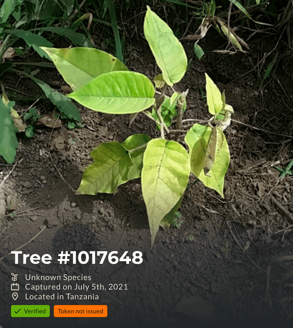
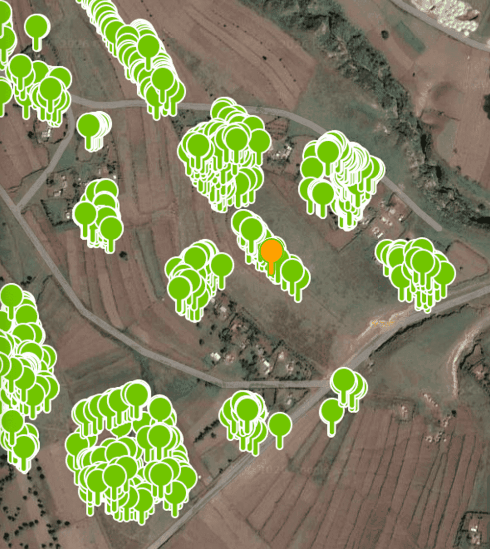
Greenstand's app, Treetracker, is used across 56 countries, particularly in developing regions, to help local tree growers document and verify planted trees through geotagged photos. Treetracker enables planting organizations and donors to track environmental impact while providing income opportunities for growers.
Tree growers capture the tree photo.
The uploaded trees are tracked on a map and verified.
Problem
Fragmented and outdated product experience
Over time, Treetracker faced growing challenges across its product experience.
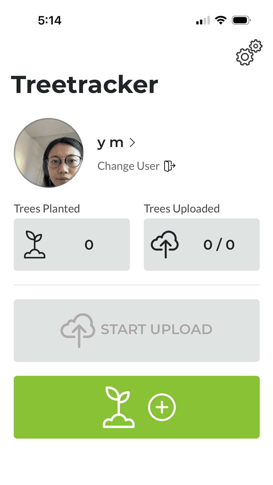
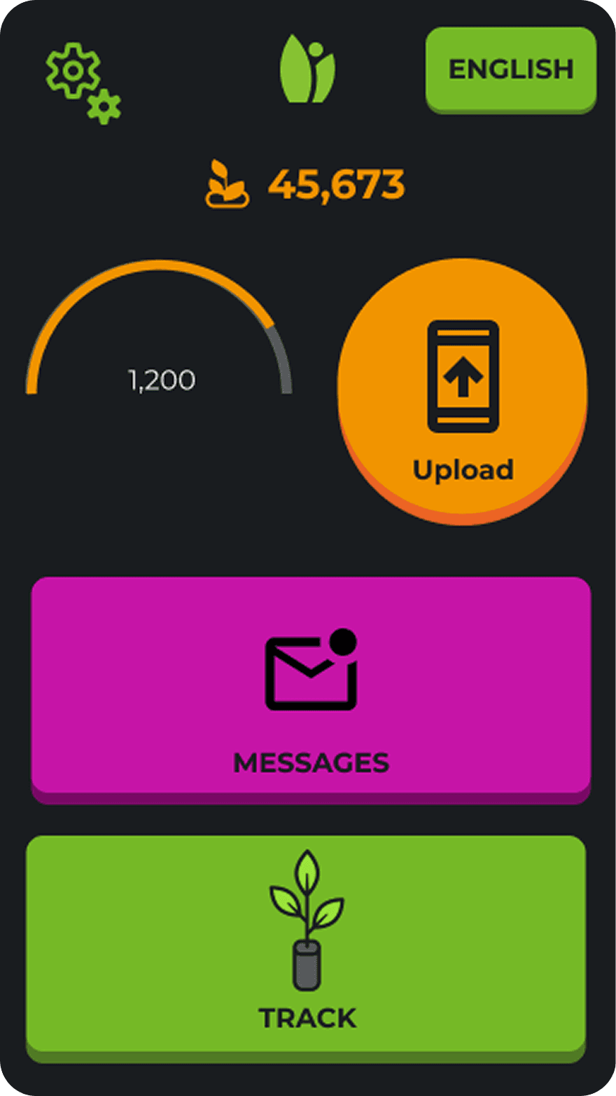
Inconsistent design across Android and iOS
Android and iOS had evolved separately, with differences in functionality, interaction patterns, and visual styles. Maintaining 2 different experiences created duplicated design effort, especially challenging for a resource-constrained, volunteer-led organization.
iOS
Android
Legacy UX with accumulated usability issues
The product, originally designed for first-time smartphone users, had become outdated as smartphone familiarity grew and UX conventions evolved. Combined with accumulated usability issues, incremental fixes were no longer enough, calling for a more fundamental redesign.
Goal
Create a unified, modernized product experience
I saw an opportunity to address both challenges together: unify Android and iOS into one consistent experience while redesigning the app to modernize the legacy UX and address broader usability issues.
Potential benefits of redesign
For users
More intuitive UX, enhanced usability
Seamless cross-platform experience
For Greenstand team
Less platform maintenance effort
Easier to scale
Approach
Start with a blue-sky redesign to drive the initiative
A product-wide redesign would require alignment beyond the design team, as it impacts the broader product and development process. I started with a blue-sky redesign to show the vision, demonstrate its potential value, and build stakeholder buy-in for the broader redesign initiative.
Context
Understanding tree tracking in constrained settings
I began by understanding Greenstand’s tree tracking workflows, users, and stakeholder ecosystem through meetings with organization executives, reviewing documentation, and conducting desk research.
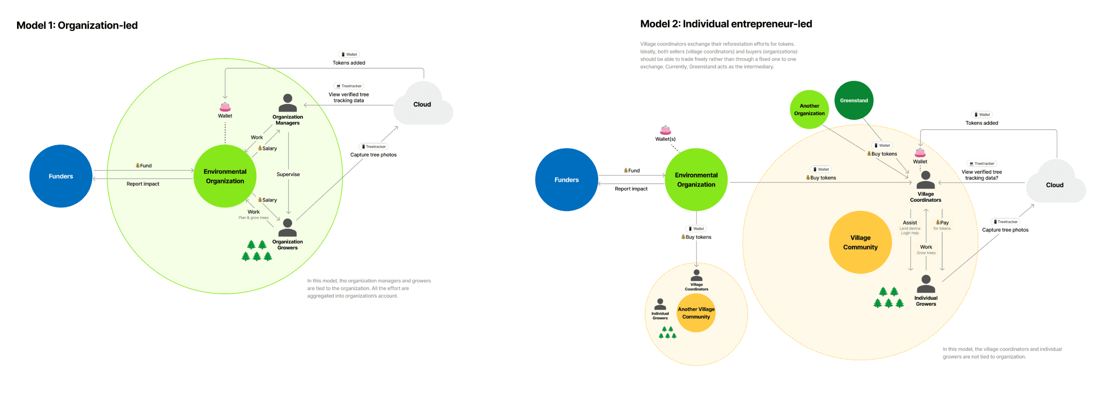
Behind the process: I mapped the Greenstand ecosystem by synthesizing fragmented information from multiple sources to validate my understanding with stakeholders.
The research led me to understand the following constraints and roles.
User Constraints
As a field-based tree planting app used in developing countries, many users operate under constraints.
Offline usage
Users often capture trees in remote areas with unstable or no internet connection.
Shared devices
Tree growers do not always own smartphones. They borrow shared devices.
Low literacy
Some users have limited literacy and may not be able to read the app.
Roles
There are 3 key user roles. I learned there are multiple operational patterns, from tree-planting organized through organizations to independent tree planting efforts.
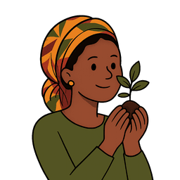
Tree growers
Plant trees to get compensated. Often do not own smartphones and have limited literacy or digital experience.
Primary user
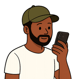
Village coordinators
Own shared smartphones and help growers use the app. Some work directly for organizations.
Primary user
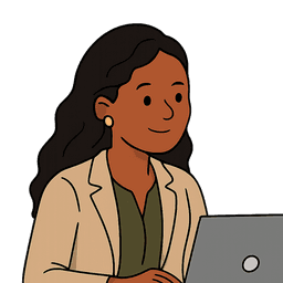
Environmental organization
Track reforestation impact. Manage users within their organizations. Verifies the trees uploaded by growers.
Secondary user
Design principles
How can I create value through redesign?
To make the blue-sky vision more compelling to stakeholders, I explored how the redesign could create meaningful value for users beyond surface-level improvements. I reviewed previously reported UX issues alongside my own audit, then synthesized recurring themes into 4 areas to guide the redesign.
1
Support the end-to-end user journey
The original experience did not fully cover the entire workflow, such as onboarding and tree verification. I aimed to support a more complete end-to-end experience across the user journey.
2
Design for constraints
As mentioned above, Treetracker is used under many constraints, but the existing experience did not fully address them. Addressing these challenges could improve accessibility and ease of use.
3
Improve system clarity
The product lacked clear navigation, labels, system status, guidance for completing tasks, and feedback on user actions. Improving clarity could help reduce confusion and increase usability.
4
Introduce polished design system
A design system could create a more consistent and branded experience and make it easier to maintain.
* The detail is covered in the design system case study.
Exploration & decisions
Translating principles into design
After defining the design principles, I explored several key decisions that would shape the redesign. Here are some examples.
Extended user flow to make planting effort visible
A primary local user goal is to get paid for their tree planting efforts, which are reviewed and verified by partner organizations using uploaded tree photos. The redesigned flow adds verification tracking and access to previously uploaded trees, giving users visibility into their progress toward compensation.
Choosing an account model for shared devices
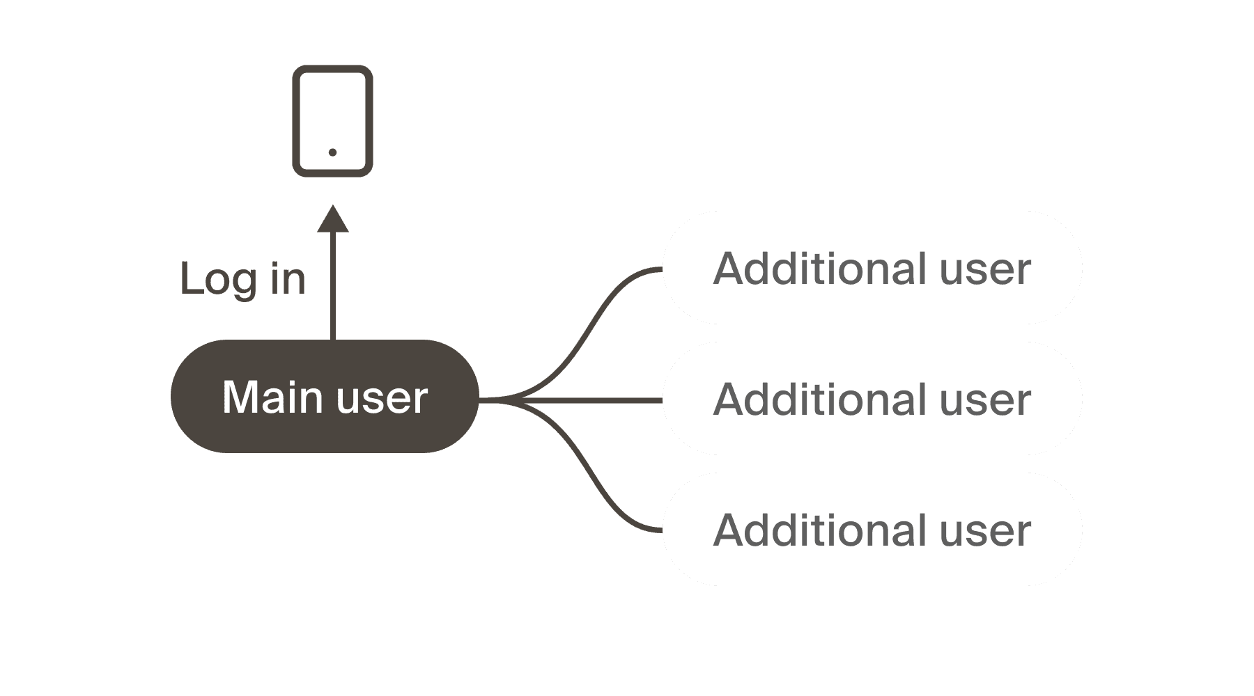
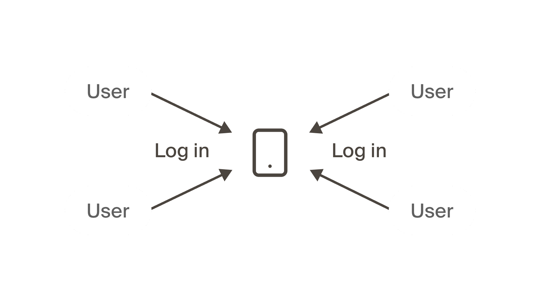
The existing app had no account system. To support long-term tracking, I needed to introduce user accounts. However, many users borrow shared devices, making traditional account models impractical. I explored 2 options: shared and individual account models. I chose the shared model, prioritizing lower barriers for borrowers who may not have personal credentials or the literacy to manage their own accounts.
Shared account model
One account with multiple user profiles
Less friction registering borrower users
Borrower users do not need credentials
Privacy concerns being dependent on owner
Individual account model
Each user has their own account on the shared device
Each user has clear account control
Sign up/log in process is too hard for borrowers
Drastic change from current flow
Balancing automation with user control
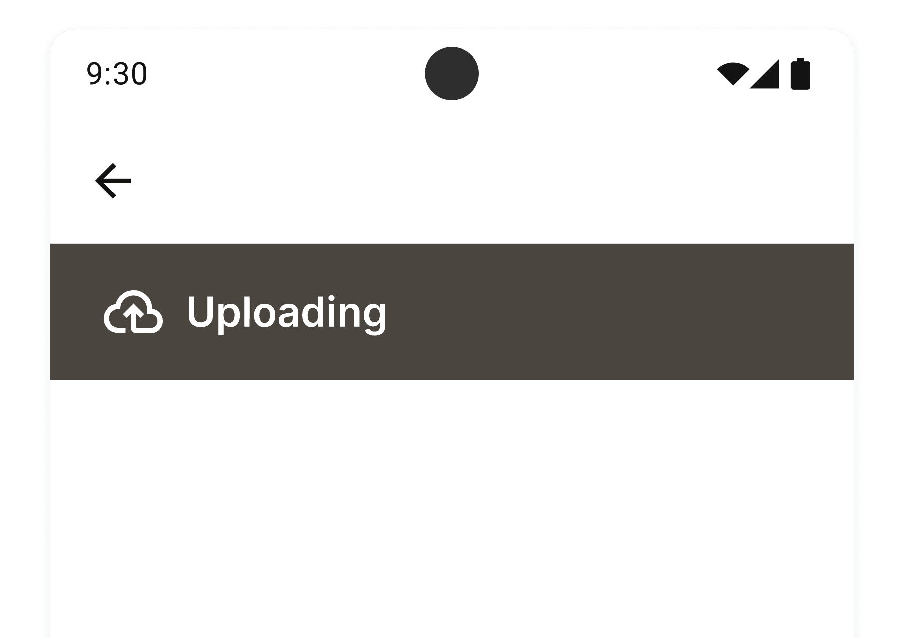
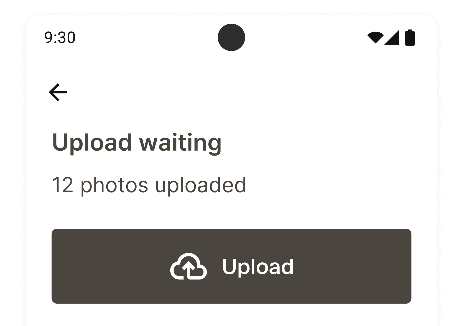
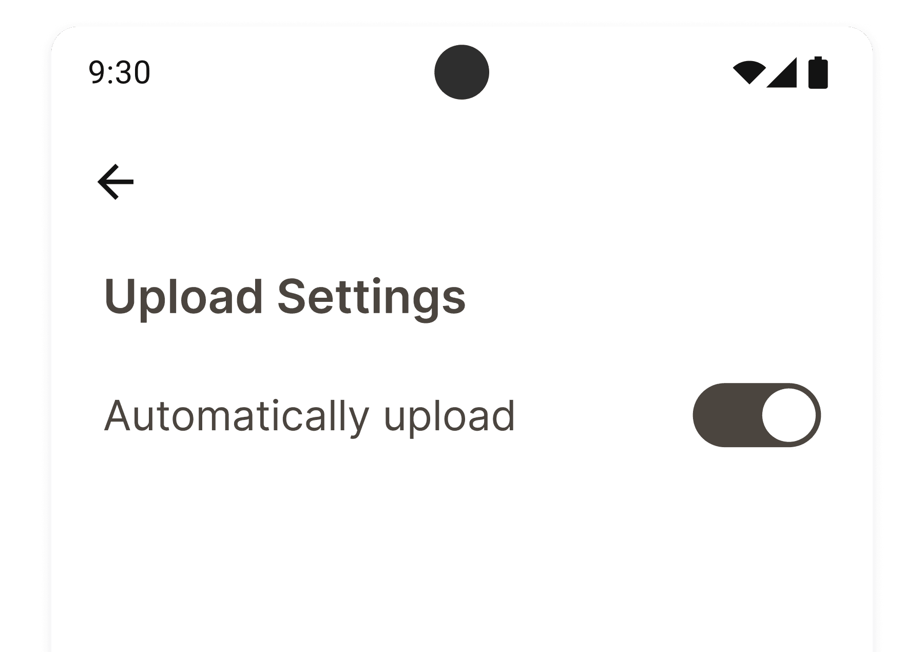
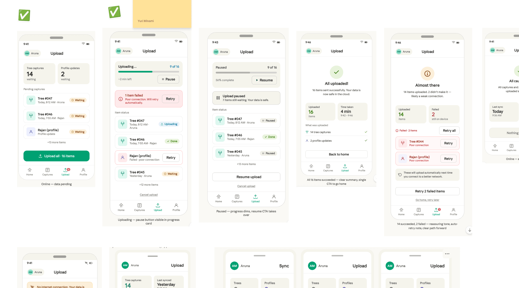
Users often capture tree photos outdoors without internet access and upload them to cloud later for review. While the existing app already supported this flow, the experience was confusing. While automatic uploads are typically the most seamless, many Greenstand users operate in regions where internet access is unreliable or expensive, making user control equally important. I chose the hybrid option to balance convenience with user control.
Automatic uploads
Automatically upload photos when a connection is available
Seamless UX for users with stable internet access
Cannot control when or in which network uploads happen
Manual uploads
Users upload photos manually
Can upload over a preferred network
Can upload at preferred time
Needs an additional step
Hybrid option
By default, manual. Users can also enable automatic uploads.
Flexible for different user needs
Final design
Coming soon...
Coming soon...
Design for constraints
Coming soon...
Improve system clarity
Coming soon...
Outcome
Redesign created, preparing for stakeholder review
This project created a blue sky redesign vision to help stakeholders imagine an ideal future experience for Treetracker. The work is currently being prepared for review to support discussions around future redesign opportunities and product direction.
Next steps
Prepare for seamless implementation and transition
If the redesign gains stakeholder buy in, the next step would be translating the blue sky vision into an implementation roadmap.
Work with engineers to define a practical cross platform strategy, maximizing consistency across Android and iOS while preserving platform specific behaviors where they support user expectations and technical feasibility.
Because a major redesign could create short term confusion for existing users, I would explore how to make the transition seamless through gradual updates, onboarding, advance communication, and migration support.
Gather feedback to validate the new design. Given the challenges of accessing local users, I would collaborate with partner organizations, contributors, and stakeholders who have direct user access.
PS: How I used AI
AI as design partner
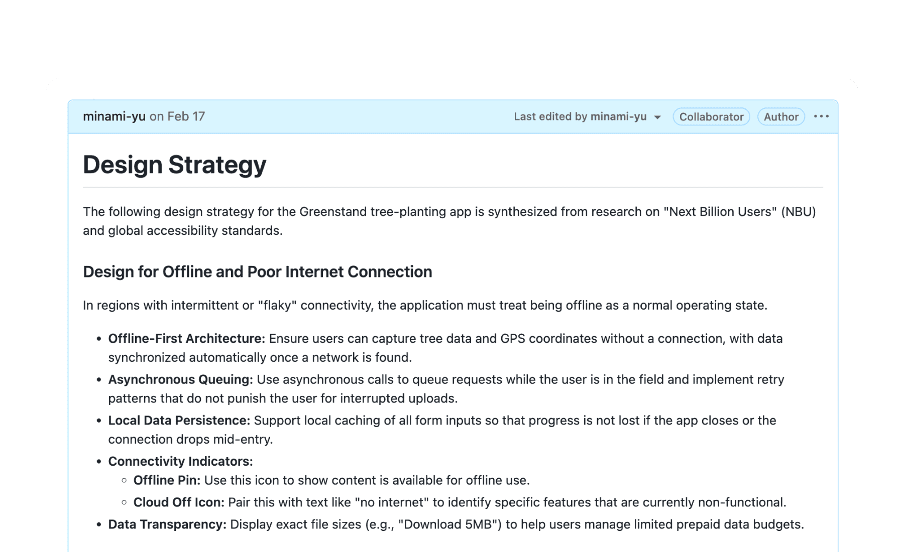
To overcome the challenges of limited direct user access, designing for a niche domain, and unique user constraints, I proactively integrated AI. I found AI especially valuable in situations with limited time and research access, while human judgment and refinement remained essential.
Best practices summary which I shared on Github.
Research
Synthesized scattered product documentation
Researched design best practices for our users' context
Created summary documents for the team
I used Claude to explore feature design and layouts.